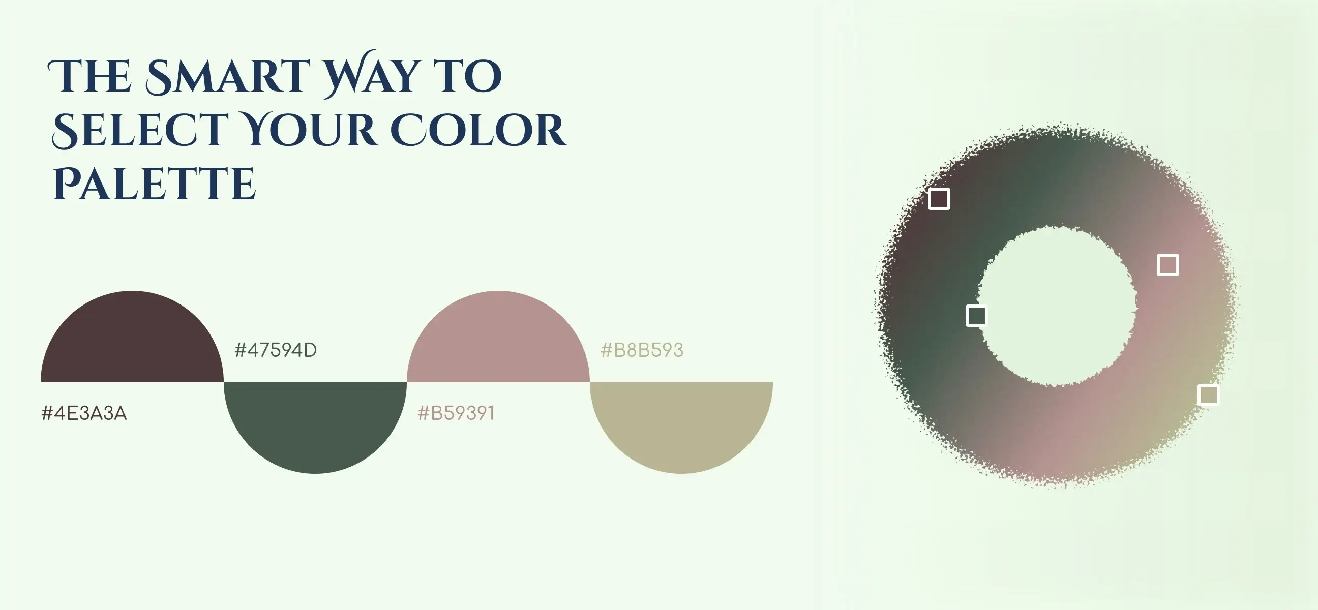
This thoughtfully curated palette blends earthy depth, warm neutrals, and soft elegance to create a modern, natural, and visually balanced aesthetic. The deep moss green (#47594D) anchors the palette with a grounded, organic feel, while the warm sage-beige (#B8B593) brings softness and calm to the overall look. Complementing them is the rich cocoa brown (#4E3A3A), adding emotional warmth and sophistication. Finally, the muted rose taupe (#B59391) introduces a gentle, stylish accent that softens the palette with subtle charm.
A beautiful fusion of earth-inspired tones and refined warmth, creating an aesthetic that feels calm, premium, and thoughtfully curated. At its core, the deep moss green (#47594D) sets the foundation with a grounded, natural energy a tone that evokes stability, heritage, and an organic connection to the environment. It guides the visual identity with strength while still feeling modern and understated.

Mood & Feel: 🌿 Calm • Grounded • Natural • Matur
Psychology:
Best Uses:
Strength: Adds depth and a modern natural feel.

Mood & Feel: 🌤️ Warm • Gentle • Minimal • Elegant
Psychology:
Best Uses:
Strength: Perfect for breathing space and visual balance.

Mood & Feel: 🍫 Rich • Earthy • Vintage • Emotional
Psychology:
Best Uses:
Strength: Makes the palette feel premium and timeless.

Mood & Feel: 🌸 Soft • Feminine • Warm • Stylish
Psychology:
Best Uses:
Strength: Adds delicate charms without overpowering the natural tones.
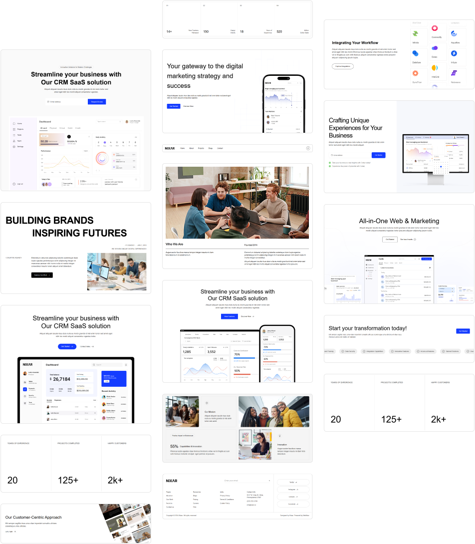
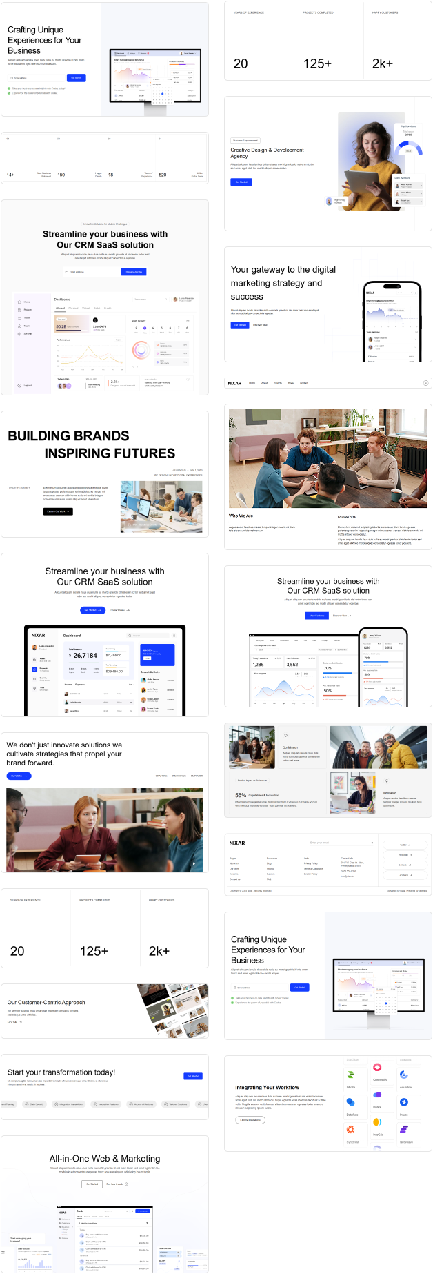
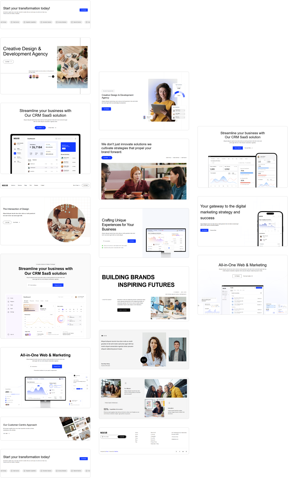
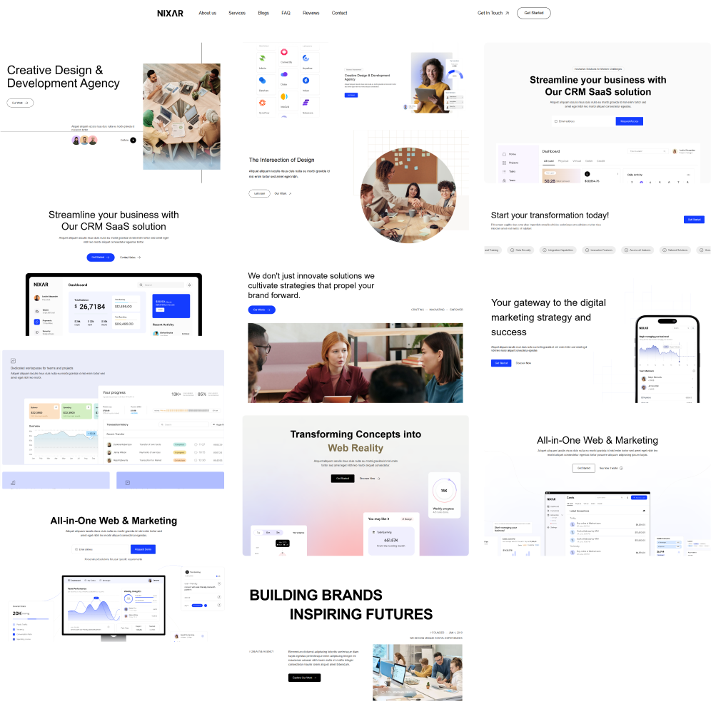
Ensure the 60-30-10 ratio stays consistent across pages
– This keeps your branding cohesive and visually appealing
– Test combinations in real layouts - Try sections, cards, typography, buttons, and hero areas to see harmony
– Use neutrals strategically - They help maintain balance when using darker or richer tones
– Highlight CTAs with the accent shade - Makes them stand out naturally without breaking the visual flow
Main backgrounds & primary sections
Secondary blocks, cards, content areas
Buttons, highlights, icons, accents
Headlines, borders, strong text

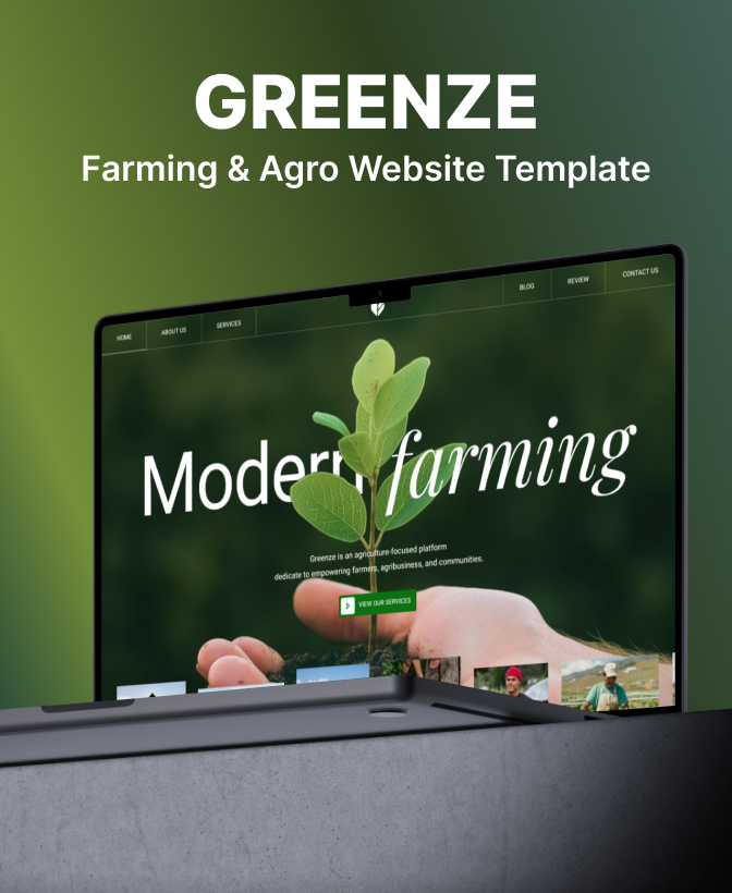
Get in touch to personalise your website with custom features and enhanced functionality.
250+ components. Zero fluff. Just clean webflow elements to help you build better websites faster.